
Last week, we discussed the value of a people-centric security strategy and established a baseline for understanding the Proofpoint Attack Index. Now, let’s consider the mechanics of surfacing the data to gain insight into those people who are most attacked—the Very Attacked Persons, or VAPs—and thus represent the most risk.
First, go into your TAP Dashboard. It should look something like this, though your user names won’t be hashed:
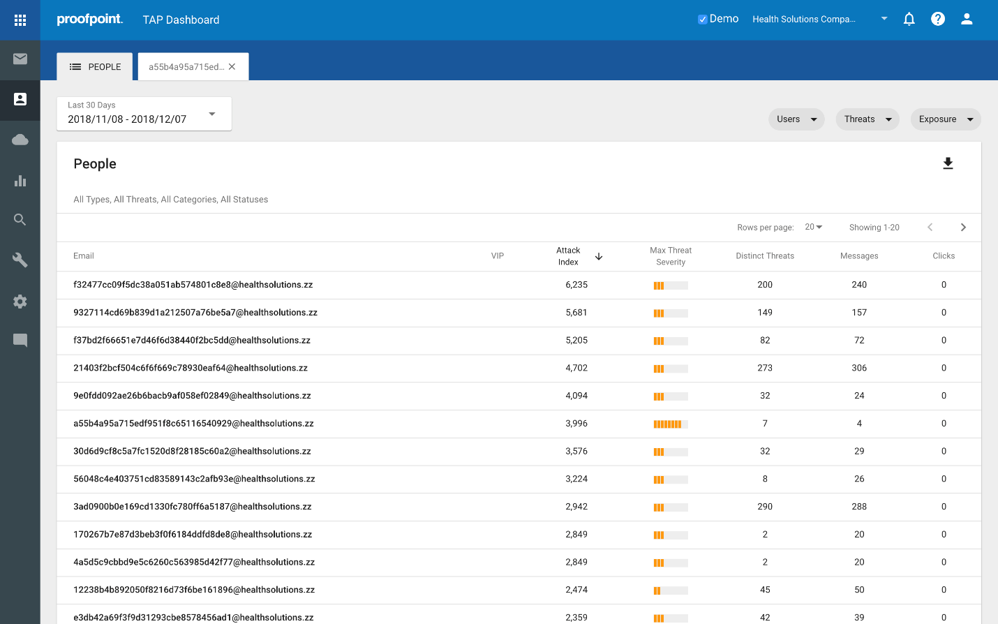
Click on the people icon (the third one down) in the bar on the left.
Select a timeframe up to 90 days back. In the example, I’m selecting a 30 day window.
Let’s walk through each column:
This will show a view of the emails for the VAPs in your organization.
VIP
The next column over highlights any users that are VAPs and VIPs. In TAP, you can identify those VIP individuals that are in your organization, be they CXO’s, key technical personnel, people with a very public facing presence, etc. These VIPs are then flagged in a way that allows you to quickly identify threat activity associated with them, i.e. it prioritizes visibility when/how they are attacked. People that are both VAPs and VIPs represent particular risk because they are both very attacked and have some significance with regard to position, access to sensitive information/intellectual property or critical systems.
Attack Index
The Attack Index column reflects the attack index described in the previous post. In summary, we assign a score to a threat based on how impactful it is. For the person in question, we then add up each of the threats he/she received in the specified timeframe. This results in the Attack Index score, which essentially reflects Proofpoint’s view of how impactful a given set of threats is within that window of time.
Max Threat Severity
This column provides a quick visual representation of the highest score of the most severe threat attacking the user in the specified timeframe. This is the highest scoring threat used to compute the Attack Index, which is useful in several ways. For example, for someone with a very high Attack Index score, you can quickly check to see if a large number of low scoring threats generated the high score, or if there is a particularly nasty threat looming in there that is worthy of prioritizing.
Distinct Threats
The Distinct Threats column simply shows the number of different threats seen in calculating the Attack Index score.
Messages
Messages reflects the number of messages in which those threats were found.
Clicks
Clicks represent the number of times threats were clicked on by this user.
Now that we’ve identified each column, look to the top right of the page. There, you will find 3 different sets of filters for Users, Threats and Exposure.
As you click on each they will expand as follows:
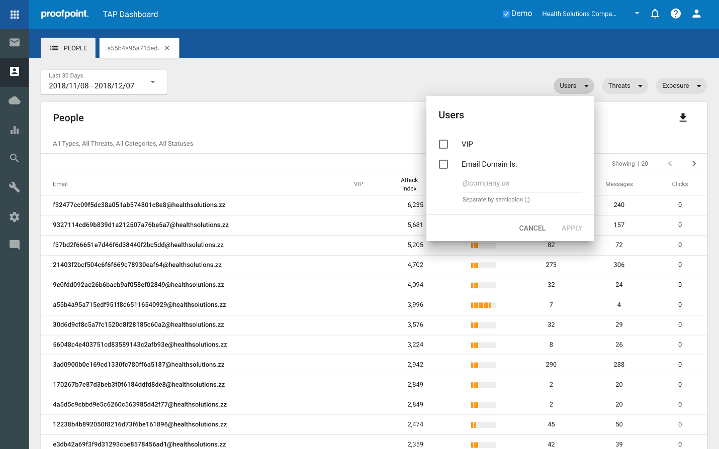
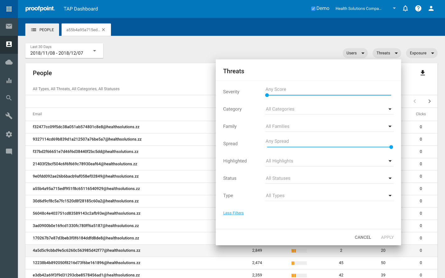
These filters are particularly useful and can be used to slice up the data to provide different views, allowing you to quickly and easily gain insights around our key questions like:
- Which Very Important Persons (VIPs) are also Very Attacked Persons (VAPs)?
- Which people within a specific subdomain or domain are most attacked?
- What people are most at risk for credential phishing?
- Who received vertically or geographically targeted threats and what are they?
- Who was targeted by the most impactful / potentially dangerous threats?
- Who received RATs, or ransomware, or <insert favorite malware variant here>?
In my next post, we’ll walk through how the Attack Index helps you rapidly answer these questions. And if you're interested in exploring how this feature can be implemented at your company, contact us here for a free trial.